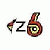
CruxGNZ Posted January 26, 2006 Author Share Posted January 26, 2006 Or... do you guys think "HybridZ.org" (capitol or lowercase "Z"?) or just "Hybrid Z" across the top? If you guys like his design, then we'll go with it. Also, that little wave on the bottom of the red "Z" is straight from the font used on the "Z" in the upper left hand corner of your screen. Would you guys want the bottom of the "Z" straight? EDIT: The patch shown is 6" X 3.25". I'm thinking it should be a bit smaller, like around 4" X 3.25" ... yes? Quote Link to comment Share on other sites More sharing options...
tfreer85 Posted January 26, 2006 Share Posted January 26, 2006 I'd say go with "Hybrid Z" we want to limit who we let in and if they ask then we can tell them about the website. Also I'd go with a straight bottom on the Z too it seems almost likes is a blemish instead of actual. IDK I'd like to see both side-by-side to compare. Tyson Quote Link to comment Share on other sites More sharing options...
Guest iskone Posted January 26, 2006 Share Posted January 26, 2006 Well, I'm all about the current logo. Maybe the way the Hybrid Z is writen with the engineered to be feared on the botton. Anyway whatever you go with I'll be down with. Isk Quote Link to comment Share on other sites More sharing options...
fastzcars Posted January 26, 2006 Share Posted January 26, 2006 I have to agree w/ tfreer85 on this one " Hybrid Z" and a straight bottom. Quote Link to comment Share on other sites More sharing options...
Twoeightnine Posted January 26, 2006 Share Posted January 26, 2006 Hybrid With the "Z" after that, straight bottom and you have a winner! Twoeightnine Quote Link to comment Share on other sites More sharing options...
DaleMX Posted January 26, 2006 Share Posted January 26, 2006 I like the big size patch, flat bottom, no internal Z. I'll buy what ever the group decides. Quote Link to comment Share on other sites More sharing options...
Vintage-TechZ Posted January 26, 2006 Share Posted January 26, 2006 I hope I'm not be ing a "part pooper" when I say that I've become pretty fond of the current header logo used at the top of the forum page......minus the car background graphic for a clean patch. Even if the whole thing would be surrounded by a "square-round" rectangle of background cloth that holds the "engineered to be feared" copy. Red "Z", with silver "HYBRID"......yellow or white background.......maybe even a light grey.?? just thoughts........Vinny 8) Quote Link to comment Share on other sites More sharing options...
CruxGNZ Posted January 26, 2006 Author Share Posted January 26, 2006 I'll send Robert the new ideas and we'll see what he comes up with. I'll post the new designs when I have them. Quote Link to comment Share on other sites More sharing options...
Guest zfan Posted January 26, 2006 Share Posted January 26, 2006 Looks great in my opinion..Way to go Mat! Mike Quote Link to comment Share on other sites More sharing options...
CruxGNZ Posted January 26, 2006 Author Share Posted January 26, 2006 I'm suprised none of you guys caught this... he spelled "engineered" wrong! I'll let him know EDIT: Just came up with this craptacular image in microsoft paint. Is this what some of you might want instead of the red Z with our slogan on it? Our software on the site would not host this image, so I had to host it on Digistash.com, so obviously "Digistash.com" will not be there. I just lack the skills and software to make better images. Also, would you guys want a white background or light grey? What color border? Quote Link to comment Share on other sites More sharing options...
Guest iskone Posted January 26, 2006 Share Posted January 26, 2006 What Vinny siad is the same thing I had in mind. Isk Quote Link to comment Share on other sites More sharing options...
240hoke Posted January 27, 2006 Share Posted January 27, 2006 I really like the idea of a hybrid patch and would buy one. But honestly that patch design is very cheesy. In my opinion it should definitly say hybridz.org. I think that should be the whole patch. I too like the header to our webpage i think it would make a nice patch. I will also say that i have gotten ragged on for wearing my hybrid shirt a few times with the "engineered to be feared" logo. Quote Link to comment Share on other sites More sharing options...
Guest iskone Posted January 27, 2006 Share Posted January 27, 2006 That design looks good! Light grey would be a good choice for a background color IMO Isk Quote Link to comment Share on other sites More sharing options...
Vintage-TechZ Posted January 27, 2006 Share Posted January 27, 2006 I'm suprised none of you guys caught this... he spelled "engineered" wrong! I'll let him know EDIT: Just came up with this craptacular image in microsoft paint. Is this what some of you might want instead of the red Z with our slogan on it? Our software on the site would not host this image' date=' so I had to host it on Digistash.com, so obviously "Digistash.com" will not be there. I just lack the skills and software to make better images. [b']Also, would you guys want a white background or light grey? What color border?[/b] I would think if the cloth background is grey, then the word "HYBRID" could be outlined in black and filled with a silver thread that "fades away" so to speak.AS it appears now. In fact ,black border/frame as well as the red Z" being bordered in black will make all the wording stand out crisply and look great ! IMHO. ...........Vinny Quote Link to comment Share on other sites More sharing options...
EvilRufusKay Posted January 28, 2006 Share Posted January 28, 2006 I'm suprised none of you guys caught this... he spelled "engineered" wrong! I'll let him know EDIT: Just came up with this craptacular image in microsoft paint. Is this what some of you might want instead of the red Z with our slogan on it? Our software on the site would not host this image' date=' so I had to host it on Digistash.com, so obviously "Digistash.com" will not be there. I just lack the skills and software to make better images. [b']Also, would you guys want a white background or light grey? What color border?[/b] Me likey!!! Quote Link to comment Share on other sites More sharing options...
Guest tony78_280z Posted January 28, 2006 Share Posted January 28, 2006 Gimme gimme, put me down for one. Quote Link to comment Share on other sites More sharing options...
Guest iskone Posted January 29, 2006 Share Posted January 29, 2006 I'm pretty phyched about the way those patches are looking. I think I'm gonna take 2 Isk Quote Link to comment Share on other sites More sharing options...
CruxGNZ Posted February 7, 2006 Author Share Posted February 7, 2006 Alright guys, I know it's been a week, but I just recieved the sample of the other patch. I think this one may be it. Let me know, patch #1 or patch #2? Quote Link to comment Share on other sites More sharing options...
Mikelly Posted February 7, 2006 Share Posted February 7, 2006 I like it! Mike Quote Link to comment Share on other sites More sharing options...
Corzette Posted February 7, 2006 Share Posted February 7, 2006 Thats it...Ill take three! Terry Quote Link to comment Share on other sites More sharing options...
Recommended Posts
Join the conversation
You can post now and register later. If you have an account, sign in now to post with your account.